Intro
A senior lecturer at the Western Sydney University MARCS Institute for Brain, Behaviour, and Development approached me to conduct a UX audit, analyse the user flow, and generate a rough prototype of improvements to the then-current iteration of the Moody Tunes App. Their goal was to make the app more attractive to young users and pleasurable for daily use. They used the UX audit and prototype to secure funding from the NSW Ministry of Health to design and develop the new app.
What Is Moody Tunes?
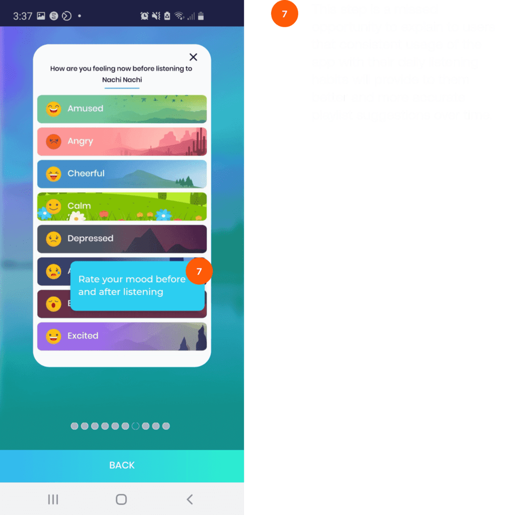
Moody Tunes is an app that integrates with Spotify. It prompts users to share their current emotional state after a selection of songs has been played. As the app gathers data over time, it learns which songs evoke specific emotions. Based on this information, it suggests playlists from the user’s Spotify account that are likely to elicit positive feelings.
Step 1: The Flow
I began the project by downloading the app and using it as intended for several days, linking it to my Spotify account and using it alongside my regular music listening habits to get a clear picture of how the app worked and how users experienced it.
After the initial set-up, the app asked users to select their current mood before the listening session began. The user then initiates a session by playing several songs on Spotify, and then the app uses notifications to prompt the user to rate their mood at the end of the listening session. This flow then repeats, leading to two prompts to rate mood and resulting in a double-up of immediate push notifications, which makes using the app difficult and frustrating.
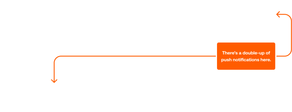
The users device displays notifications in chronological order meaning the notification for mood rating at the beginning of Session 2 takes precendence over the notification to rate mood after Session 1.

The New Flow
I tweaked the flow to improve the app’s user experience, removing one instance of a mood rating prompt between listening sessions.
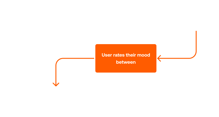
The mood rating prompt at the beginning of the second/nth listening session was nixed to allow a more seamless way of listening and rating mood, removing the potential friction point of users experiencing duplicate and confusing push notifications on their device.
Step 2: The UX Audit
After mapping the current and new user flows, I conducted a UX audit on the current iteration of the app, involving a heuristic analysis and an analysis of the app’s accessibility. I also identified opportunities to make the app more pleasurable to use to increase users’ daily usage, giving it the best chance to collect the data it needs to work correctly.
Heuristic Analysis:
As a self-confessed Nielsen Norman Group fan, I believe that Jakob Nielsen’s 10 usability principles are a good reference for conducting a heuristic analysis.
However, since their initial publication in 1994, technology and interfaces have changed vastly. After some research, I came across Costin Pribeanu’s A Revised Set of Usability Heuristics for the Evaluation of Interactive Systems (Source), which is based on Nielsen’s original 10 Heuristic Principles but more applicable to current technologies.
Using Pribeanu’s Heuristics, I made a series of recommendations for improving the app so that it provides users with a more seamless and frictionless experience.
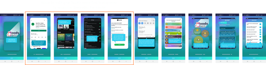
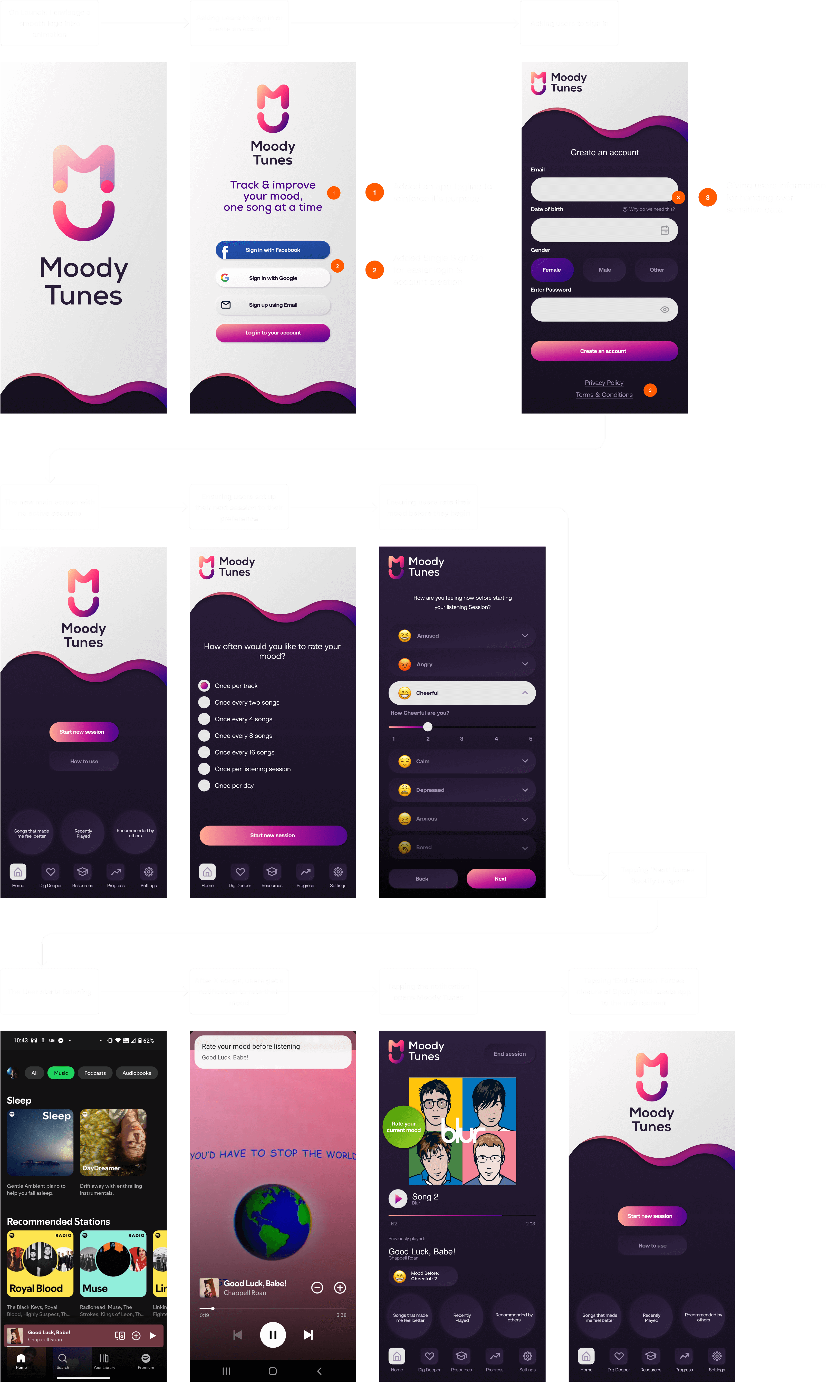
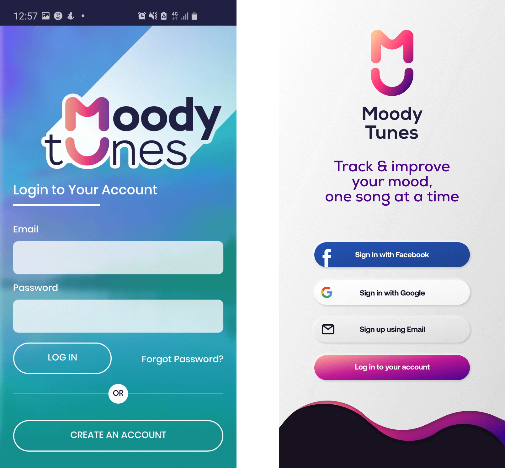
Upon First Launch
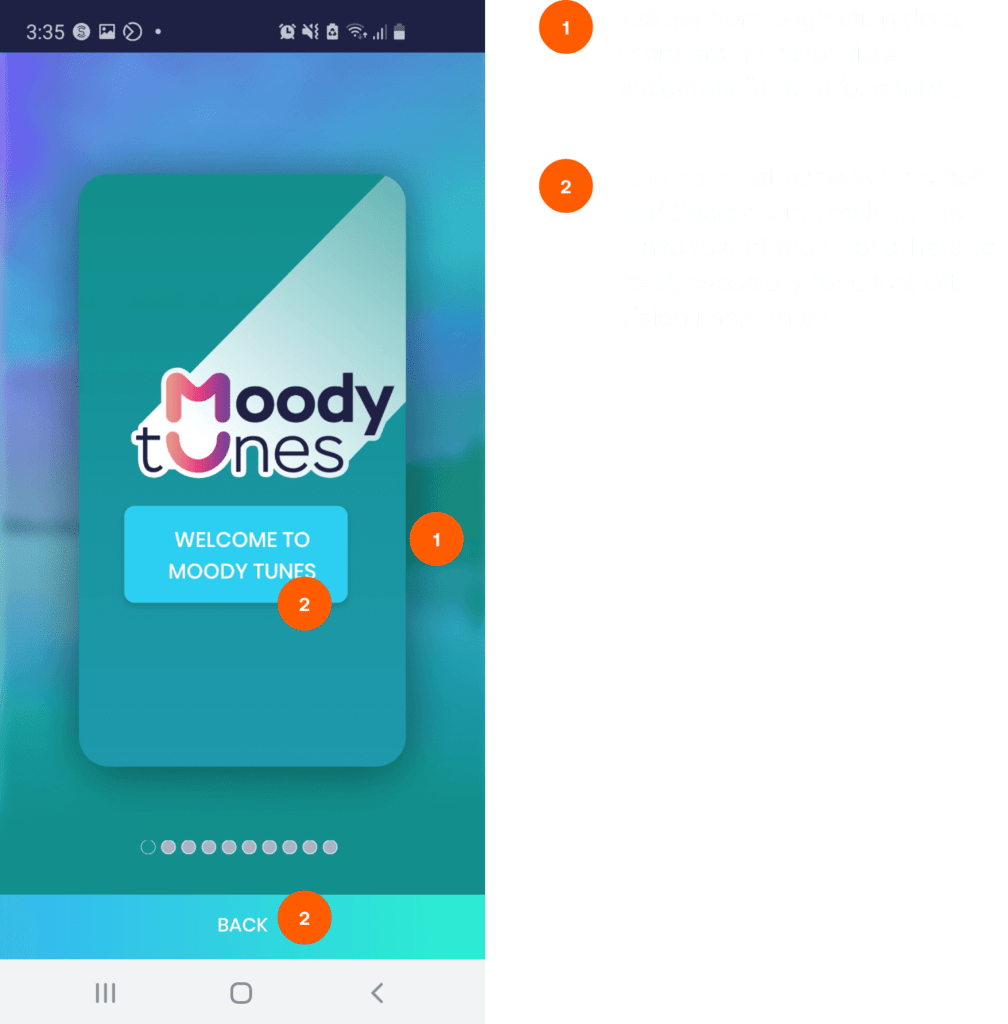
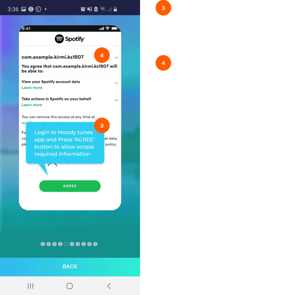
Upon the app’s first launch, users were presented with a slideshow meant to serve as a tutorial showing them how to link the app to their Spotify account and a series of screenshots with very brief instructions.
Aside from linking their account to Spotify, users are given no further instruction on how to initiate a listening session, how to set the number of songs to be in a session before receiving a mood rating prompt, or, most crucially, how to use the app consistently to get the best results.
The instructions for setting up key functionality that would allow the app to work with Spotify are located in the first 3 steps of a 10-step tutorial, forcing users to try to remember the locations and names of these advanced controls, which would lead to more failures than successes and ultimately reduce the rate at which users stick to using the app after the first launch.
Several other items were identified as needing improvement in the audit, touching on accessibility, aesthetics, lack of user control, language clarity and overlooked opportunities to promote consistent daily usage to the user.

Improvements:
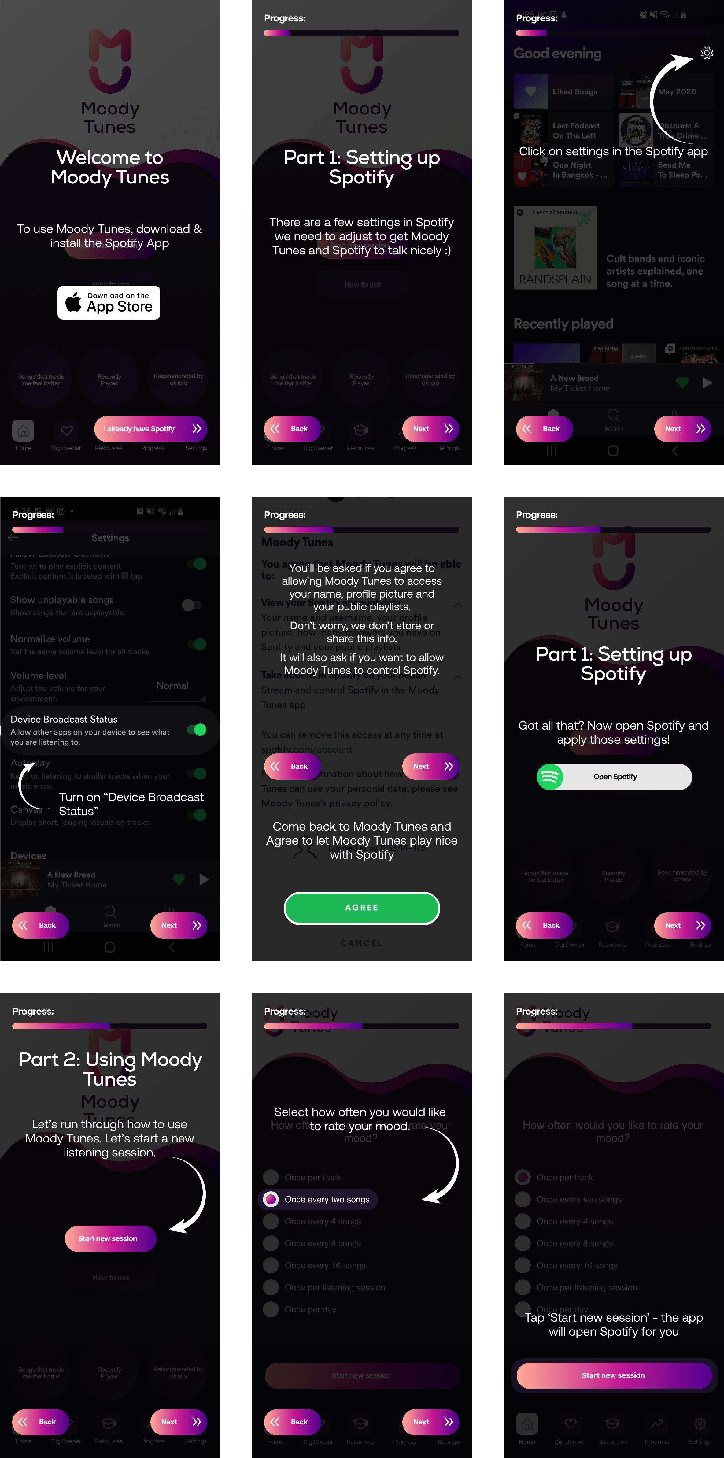
I recommended a series of improvements to the tutorial screens that would expand upon the current guidance to give users easier access to Spotify, pinpoint exactly what to configure by making the correct settings more noticeable, add more information as to the value the app would provide users with consistent usage, and add guidance on setting the frequency of mood rating prompts.
I also recommended they make the first-launch tutorial interactive. This would allow users to input the settings they need within the tutorial itself, reducing the effort required to set the app up to their specifications.
The Main Screen
I recommended several improvements to the app’s main screen that would enable users to use the app more effectively.
A Clear Starting Point
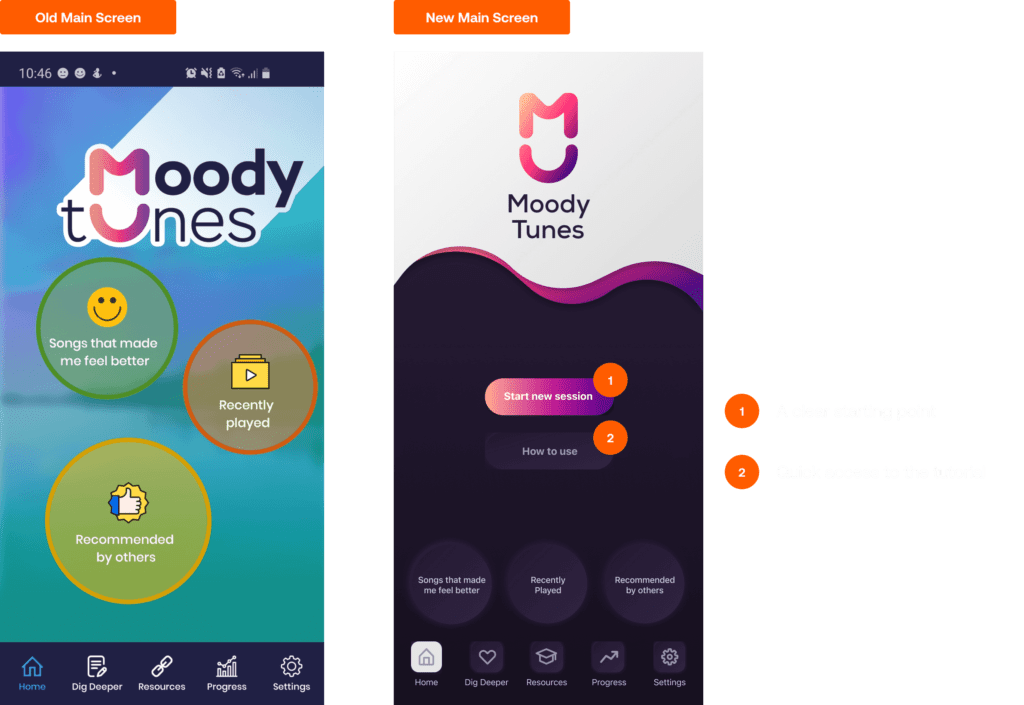
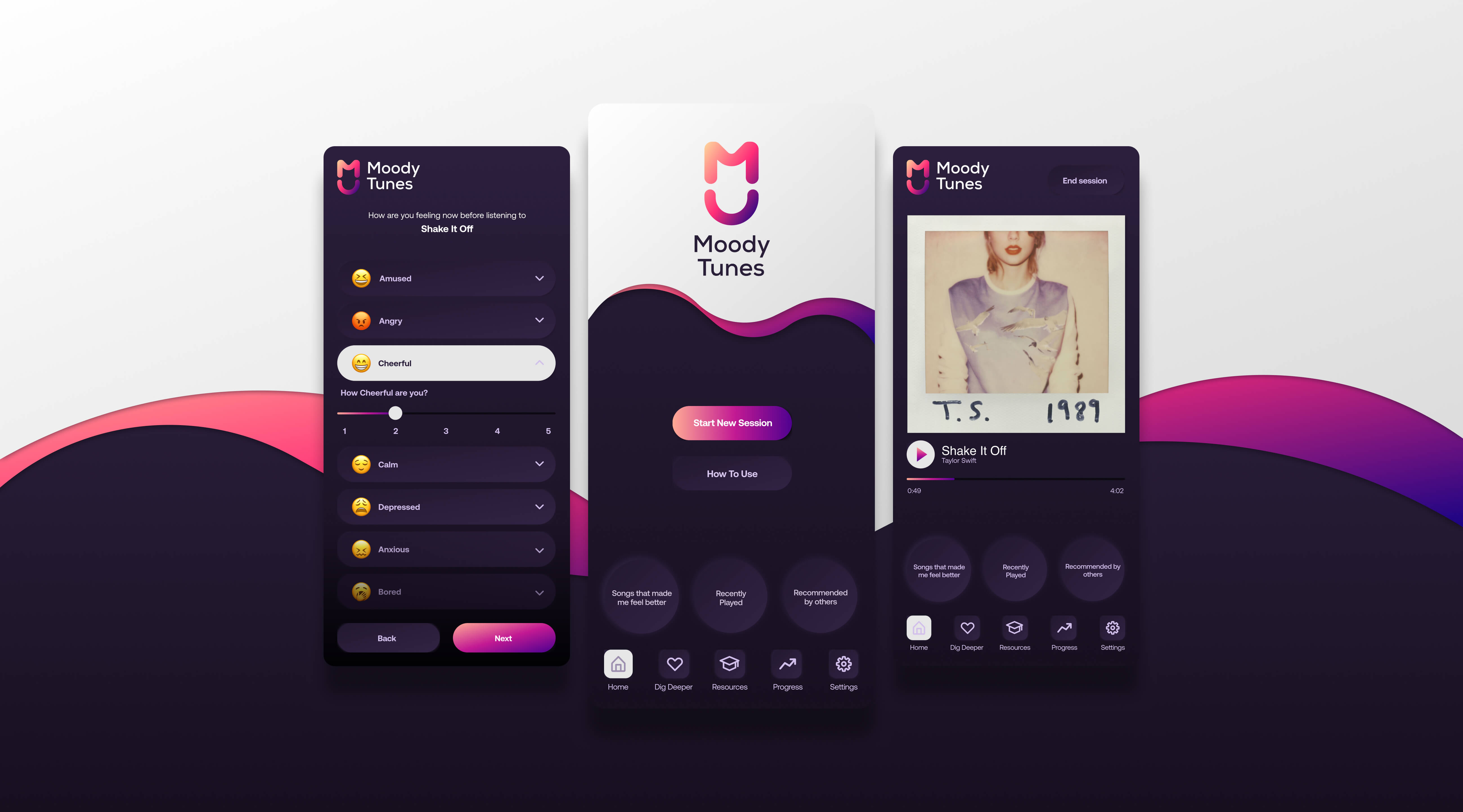
The original iteration of the app provided users with no clear starting point to initiate a new listening session and no clear way to end their current one. This meant that once set up, the app would run in perpetuity.
I added a new button to the app’s main screen – Start New Session.
When tapped:
- The user is asked to select their preferred frequency of mood rating prompts (e.g., mood rating prompts after every 1, 4, or 6 songs, after Spotify closes, or every day).
- They are asked their mood before initiating the session.
- The app then opens Spotify for the user.
- The user selects a song or a playlist.
- The user gets a push notification to rate their mood.
- The app opens when users tap this notification and asks them to rate their mood.
I also added an End Session button that appears when a listening session is underway.
When tapped:
- The app forces the closure of Spotify.
- Then, it opens the mood rating screen and sends users a push notification to rate their mood (should the closure exit to the home screen).
Access to the Tutorial
Due to the more advanced settings users need to access when linking the Moody Tunes app to their Spotify account, I added a clear access point to the tutorial on the app’s main screen so that users can view it anytime after the initial app launch on their device.
Indicators of Completion
In the original version of the app, there was no indication as to whether users had rated their mood before or after the current song was playing – these are stored purely in the phone’s native notification centre. The accessibility and ‘lifetime’ of these notifications depend on the user’s settings, which may result in many missed opportunities to get the user to rate their moods at the appropriate time, i.e., if the user has set notifications to clear as soon as they close their notification centre. The song may end, and they will miss rating their mood for the previous song.
Solution
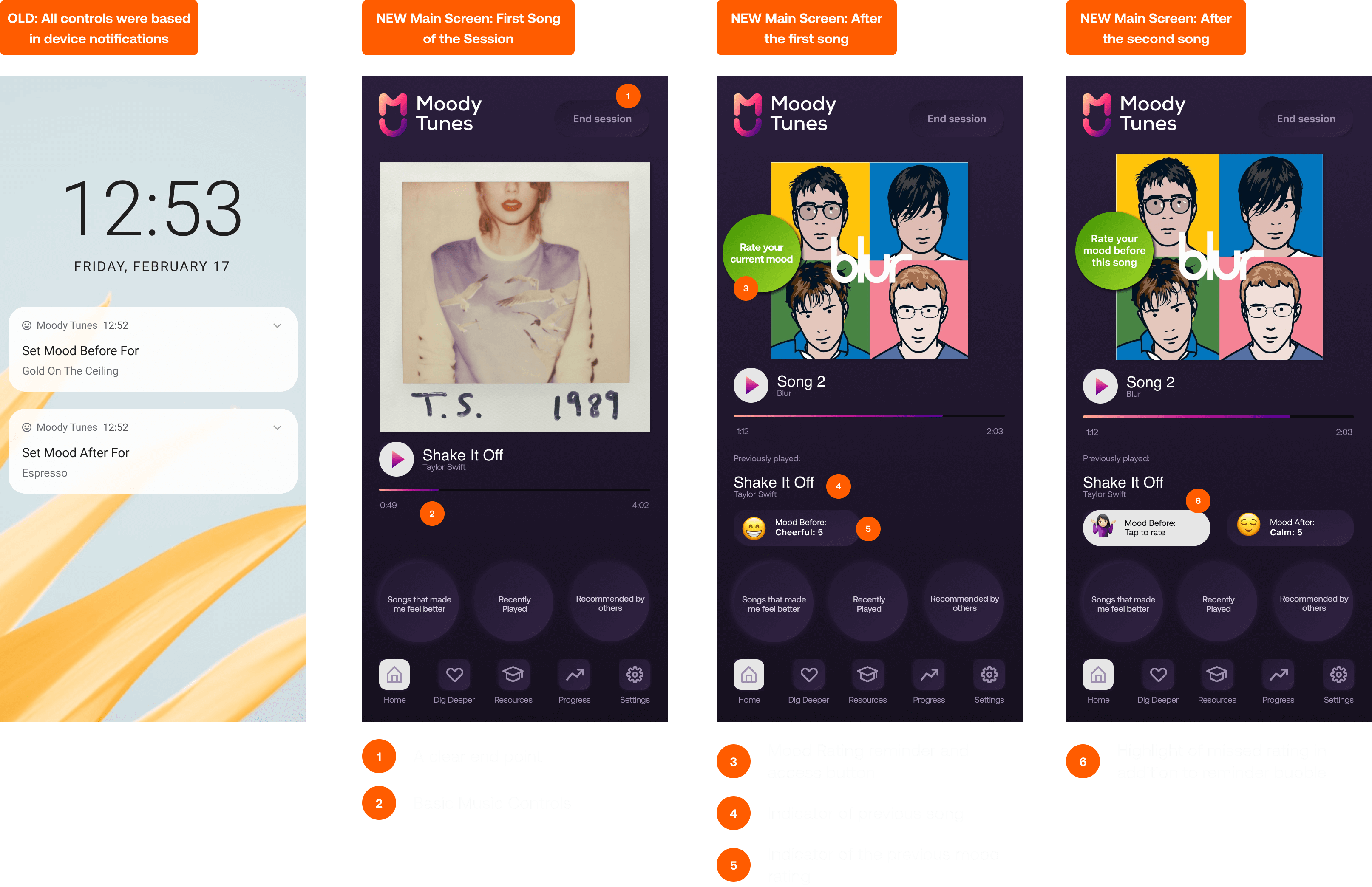
To solve this, I added the song playing with some basic listening controls to the app’s main screen once a listening session had been initiated.
For cases when the user has initiated a new listening session and failed to rate their mood, a bright bubble placed over the album artwork alerts users to this.
Once the user has rated their mood, the play controls shrink, and their selected mood and rating level are displayed. When tapped, they can adjust their pre-listening mood rating.
Where a user has neglected to rate their mood before the previous song and before the current song, they are presented with the bright bubble and a lighter prompt button below the title of the song that was previously played.
Other technical recommendations
Ending a session
When the user quits Spotify, the app does not recognise the end of their listening session. On relaunch of the app, the user was prompted to rate their mood for songs they heard in the last listening session, although this may have occurred several days prior.
I recommended that the app should:
- Recognise when Spotify is closed,
- Send the user a push notification to rate their mood,
- Automatically close the open session,
- Add an expiration time to prompt the user to rate their mood, for example, 8 hours.
These changes were recommended to reduce user frustration with the app upon its launch, provide users a more streamlined experience, and prevent inaccurate mood data collection.
Some Before and Afters


The Result
My recommendations and prototypes for the new version of the Moody Tunes app helped the Western Sydney University MARCS team secure a significant grant from the NSW Ministry of Health. The grant will fund the app’s development and further study into how music choices affect our mood.
Interested in the research fueling and coming out of the Moody Tunes Project?
- MoodyTunes: A mixed methods usability study of an app for adolescent mental health – read online
- Music listening and emotion regulation: Young people’s perspectives on strategies, outcomes, and intervening factors – read online
- Encouraging help-seeking and engagement in a mental health app: What young people want – read online