Intro
With the imminent closure of the 3G network across Australia, the Australian Mobile Telecommunications Authority (AMTA) needed to improve its digital presence so that users affected by the closure would take its communications and online resources seriously.
The Problem
As the industry body representing Australia’s telco industry, AMTA’s goal for their digital presence was to increase user perceptions of their position of authority in the telecommunications industry.
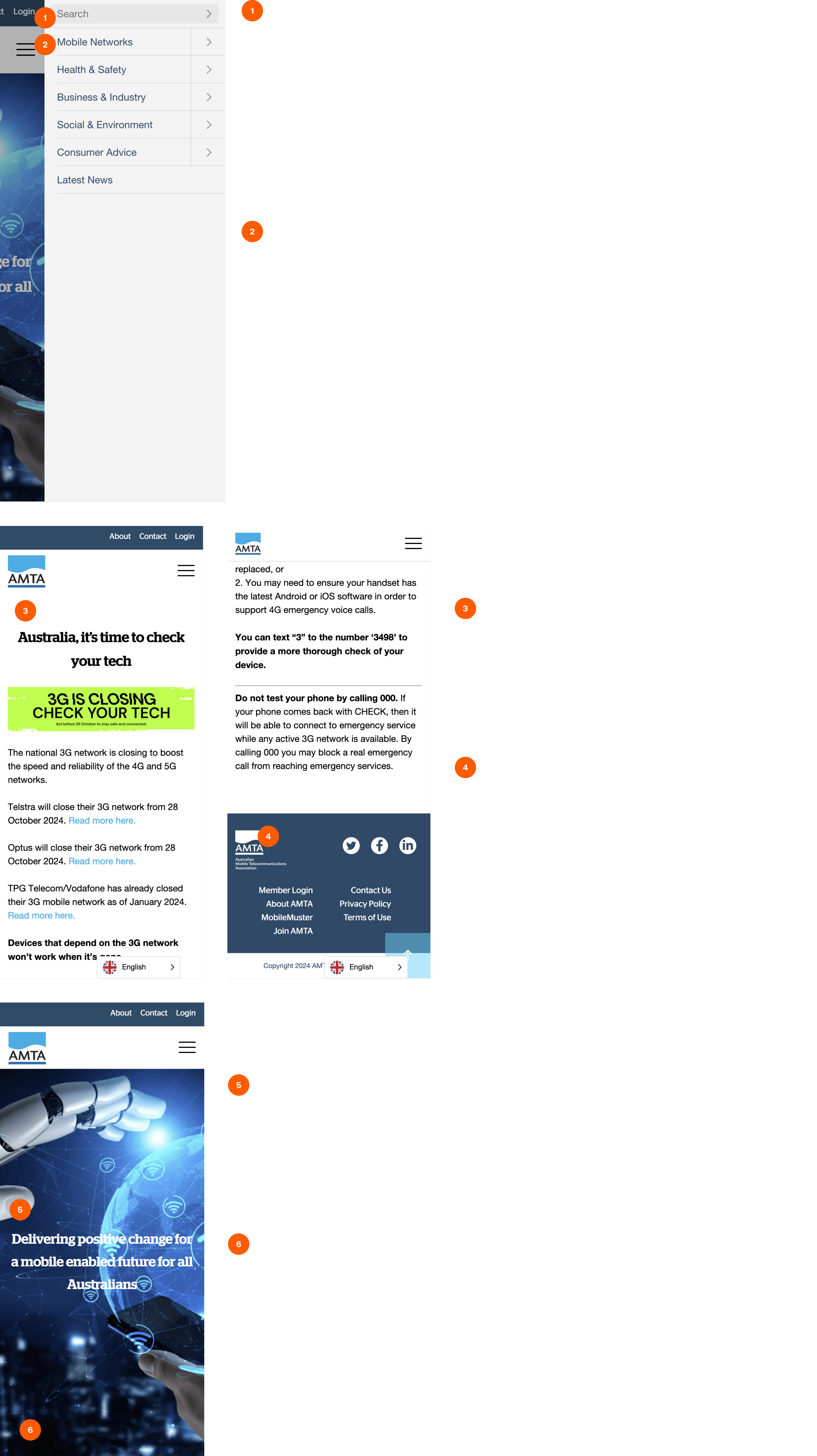
The design and structure of the website needed to be straightforward to navigate and required to comply with WCAG standards. Meeting these accessibility and usability standards was particularly pertinent as users still relying on the 3G network in Australia tend to be elderly users of older phones, people relying on personal medical alarms and users of pacemakers and implantable cardioverter defibrillators, which also tend to be elderly or carers of older adults.
Due to the impact of the closure, having the website be able to communicate such critical information effectively was a priority.
In addition to network information, ATMA’s website also provides businesses that rely on networks and telecommunications infrastructure with information surrounding the changes in standards and compliance issued by the government and industry regulators. So, the website needed to improve how these users find and identify this timely and impactful information.
The Solution
The UX Audit
To pinpoint and prioritise the adjustments to the website that needed to be made, we conducted a UX audit.
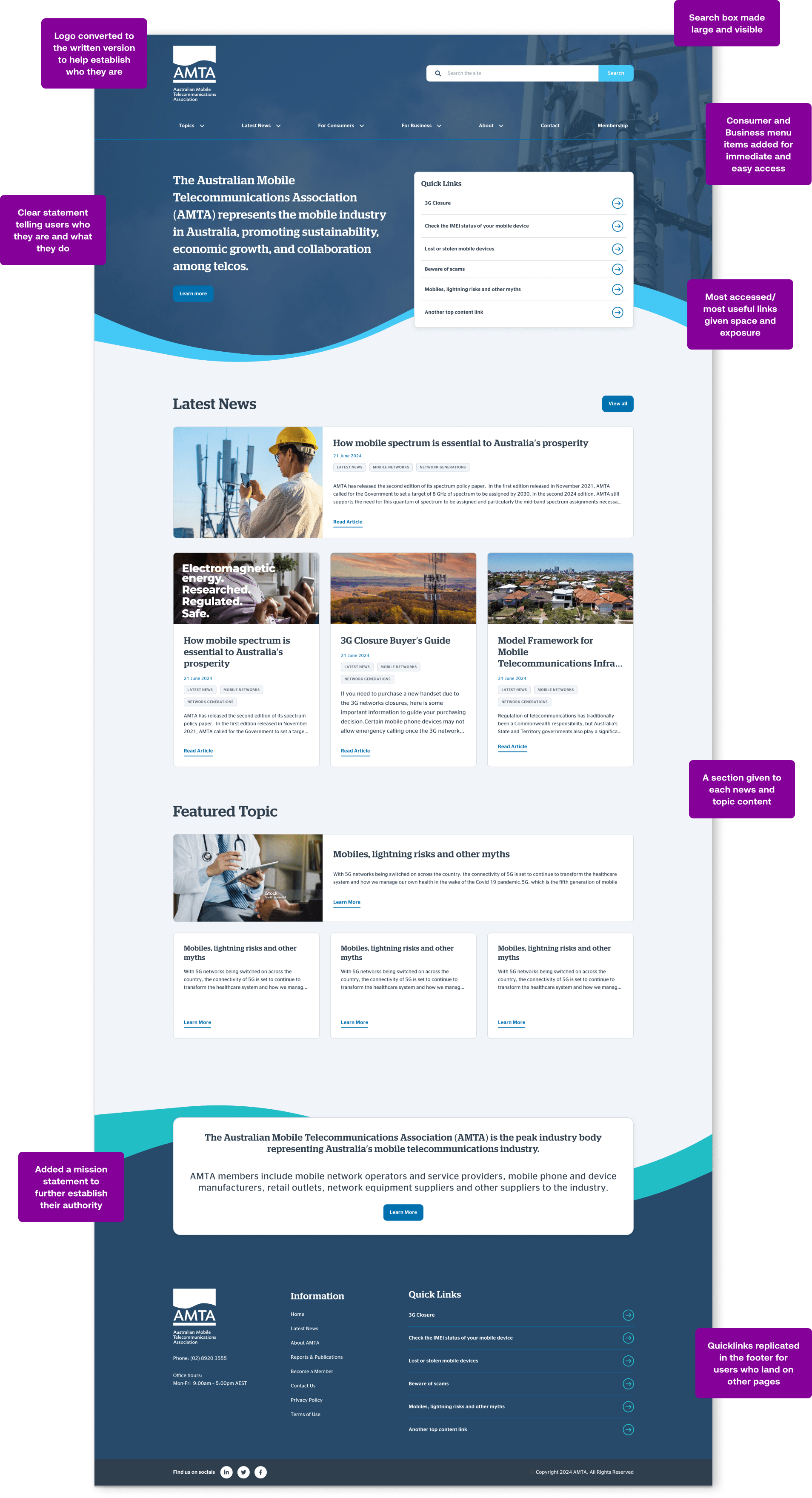
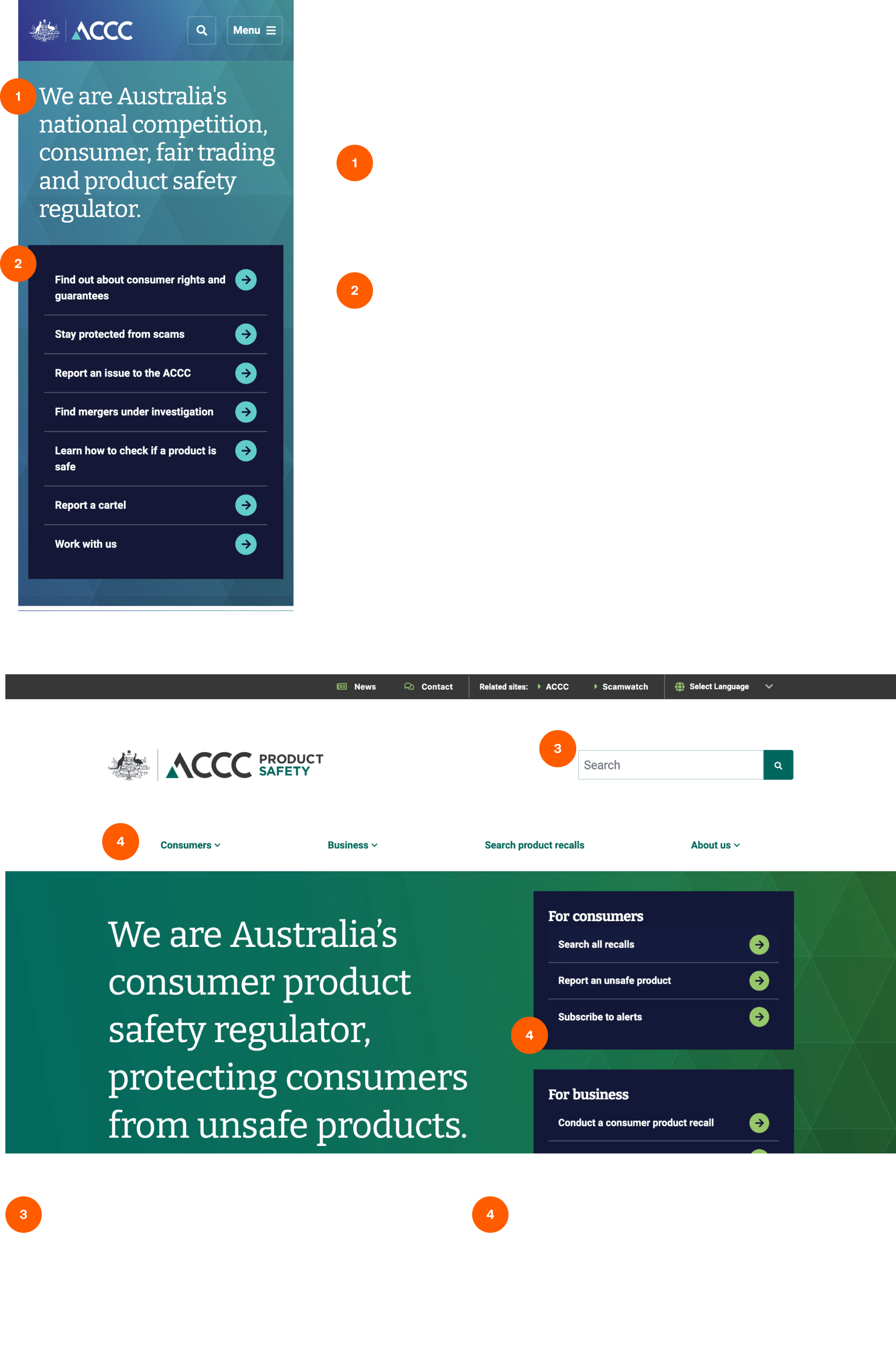
We started the audit with a quick competitor analysis, showing how other websites, specifically government websites, give users a clear, concise overview of the company at first glance; they give users quick access to content that is most widely used; they offer users a large, accessible search field and they a make clear distinction between areas of the site catered towards consumers and businesses.
We then turned our attention to the website, conducting a Heuristic analysis and using research from sources including the Baymard Institute and The Nielsen Norman Group to generate and validate the highlighted issues.
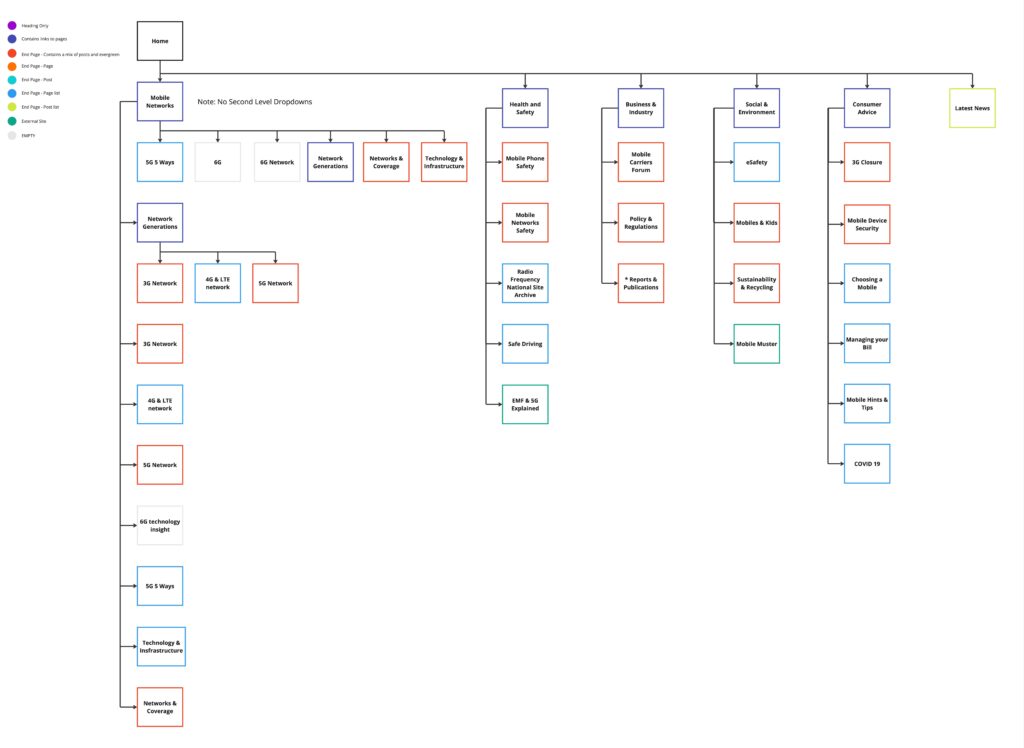
The Information Architecture
Two important issues raised in the UX audit were with the website’s poor navigation and the lack of a clear delineation between content that is news and content that is ‘evergreen’. These two issues prompted an informationa architecture exercise, where the website’s current navigation structure was mapped out, and a new one made based on the audit recommendations.
The main changes to the website’s content and structure were:
- Making a clear distinction between ‘evergreen’ content (pages) and news articles (posts)
- The duplication and increase in exposure of the consumer and business content of the website
- About, contact and other valuable pages being brought into the main menu, where before they were essentially hidden in a secondary menu.
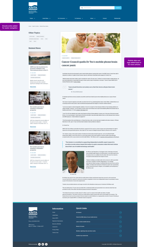
Restructuring the website ‘s content would allow us to use post metadata (author and publish date) for news articles, thereby giving them context and time, add breadcrumbs to the pages for easier navigation, and bringing more visibility to the consumer and business content.
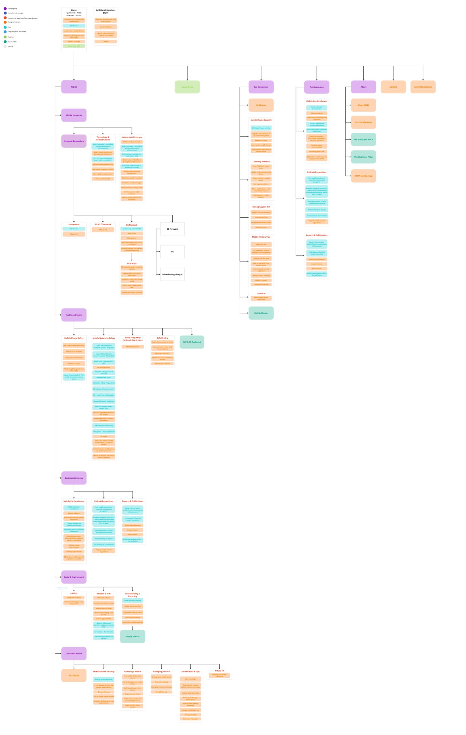
In lieu of the scope to conduct user testing to discover and validate a better way of organising and structuring the site, duplication of the content, and using mega menus and sidebars to help expose more content would have to be enough.
In an ideal world, I would recruit several participants to aid in labelling and sorting these items.
The Redesign